 Back to the site

Brand guidelines
Morbid Rose
Beauty, softly undead.
Gothic beauty and dark romance. These pages define the mark, the palette and the type, so the brand looks like itself wherever it appears.
The mark
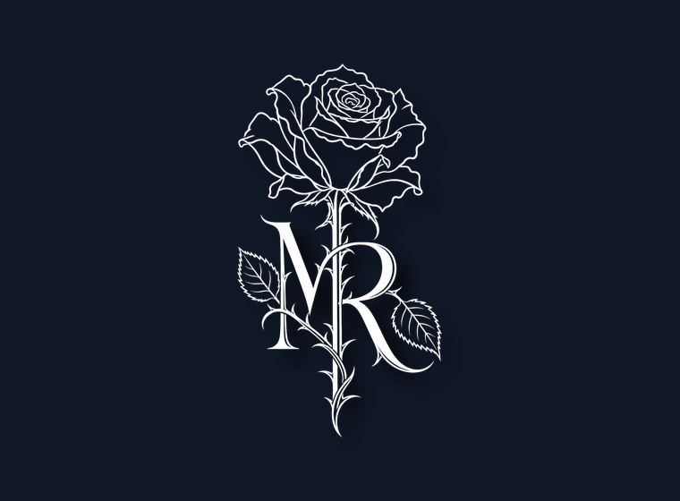
A rose whose stem becomes the letters
The stem resolves into an MR ligature. It is drawn, not typed: the letterforms belong to the illustration and are never re-set in a typeface.
| Lockup | Use it for | Not for |
|---|---|---|
| Mark | Stamps, foil, embossing, a watermark over video, anywhere the name already sits beside it. | First contact with someone who has never seen the brand. |
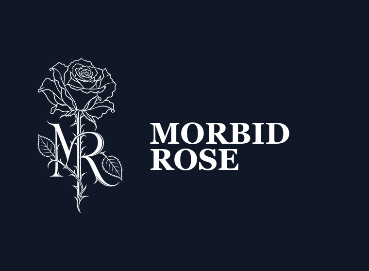
| Horizontal | Site headers, letterheads, email signatures, banners, press. | Narrow columns. Below about 240 px wide the wordmark closes up. |
| Stacked | Posters, packaging panels, anything tall. | Wide, shallow spaces. It is roughly 1:2. |
| Square | Avatars, app tiles, stamps, any 1:1 frame. | Large-format print, where the full mark is used instead. |
The square drops the monogram and the stem on purpose. A square mark is used small, and at those sizes the MR and the thorned stem close up into noise. The flower and a little of its stalk are what survive.
Colourways
Three, and only three
White on anything dark. Black on anything light. White on one of the two brand grounds. There is no full-colour version of the mark: the rose is line art, and filling it loses every petal edge inside the bloom.
Files for press use pure white and pure black rather than bone and black sea. They land on backgrounds nobody controls, and a near-white reads as dirty against true white. Bone and black sea are for surfaces the brand owns.
Clear space and size
Give it the height of the bloom
Leave space equal to the height of the flower head on all four sides. Nothing else sits inside it: no type, no rules, no image edge.
| Lockup | Minimum width | Below that |
|---|---|---|
| Full mark | 90 px / 20 mm | Use the flower head alone, never a shrunken mark |
| Horizontal | 240 px / 50 mm | Use the square or the mark |
| Square | 64 px / 16 mm | Use the flower head without the words |
Misuse
Five things that break it
Each of these is reproduced here so it is recognisable. None of them is in the logo pack.
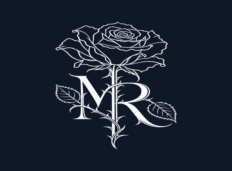
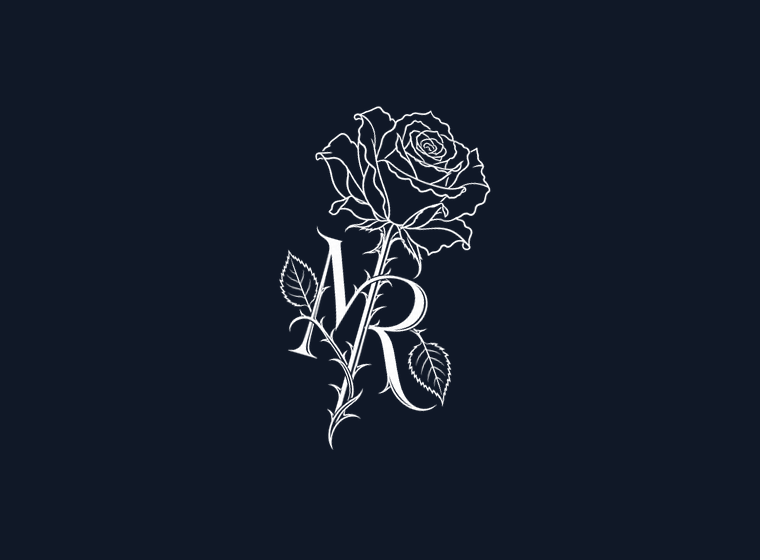
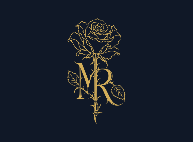
Also: no busy photograph behind the mark without a solid panel, no outline, and no crop that runs the bloom off an edge.
Colour
Blue holds, red points
Blueberry carries weight and fills large areas. Cherry points at one thing at a time. Cherry as a background makes the brand look like a sale.
The mix
Measured contrast
| Pairing | Ratio | Verdict |
|---|---|---|
| Bone on black sea | 16.24:1 | AAA. The default pairing. |
| Bone on deep water | 14.73:1 | AAA. Text on cards. |
| Bone on blueberry | 9.77:1 | AAA. Text on a filled button. |
| Cherry, lightened, on black sea | 7.30:1 | AAA. Use this for red text. |
| Slate on black sea | 6.58:1 | AA. Captions only. |
| Cherry tomato on black sea | 4.87:1 | AA, and only at large sizes. |
| Blueberry on black sea | 1.66:1 | Fails for text at any size. Fill only. |
That last row is the reason blueberry is a fill and never a text colour. Never introduce gold, and never introduce a second accent.
Type
Bodoni Moda over Karla
A high-contrast Didone for the line people remember, a plain grotesque for everything they read. Both are on Google Fonts under open licences.
- Set Bodoni Moda's optical size to 96 for display. It defaults to 11, the text cut, which goes muddy when set large.
- Give uppercase labels real letter-spacing, around 0.22em.
- Keep running text near 65 characters a line.
- Declare a fallback: Didot, then Georgia, for the serif.
- Set a paragraph in the serif, or the brand name in the sans.
- Use Cormorant Garamond or Montserrat.
- Use blackletter. The gothic here is romantic and funereal, not a metal band.
- Fake a weight with a stroke, or condense the face to fit.
Voice
Reverent, precise, warm underneath
- Softly undead since 2026.
- Beauty where everyone else looks away.
- The slow part is the point.
- Everything worth keeping was once alive.
- Slay queen, obsessed, this is everything.
- Emoji strings, all caps, thirty hashtags.
- Fake scarcity, countdowns, link-in-bio spam.
- Anything self-harm adjacent, or real human remains.
Death, decay and mourning are beautiful, never a joke or a shock. The name is Morbid Rose in prose, two words, both capitalised; themorbidrose for handles. Never MorbidRose, never MR on its own, never a possessive.